What Is a Landing Page? Definition, Types & How It Converts
A landing page is a standalone web page built for a single marketing campaign and a single goal. Visitors "land" on it after clicking an ad, an email button or a social post, and the page has exactly one job: to move that visitor towards a predefined action such as filling in a form, starting a trial or completing a purchase.
That single-mindedness is the entire point. A normal web page is built for browsing; a landing page is built for converting. A good one has no menu, no side topics and no second offer competing for attention.
The principle fits in one line: fewer choices, one clear offer. Below we unpack how that principle works in practice: the difference from a homepage, the main types, real usage scenarios, the elements that drive conversions, how to build one, how to measure it, and the part most guides skip entirely, which is what happens after the form is submitted.
What problem does a landing page solve?
Picture a paid campaign. You pay for every click and send visitors to your homepage. They see the menu, skim a blog post, glance at the about page and, more often than not, leave without doing anything. The click you paid for turns into an aimless stroll.
A landing page closes that leak. Whatever the ad promised, the page delivers exactly that and nothing else, so the visitor faces a single path: accept the offer or leave. It sounds strict, but that is the logic of conversion. A conversion is simply the visitor completing the action you defined: submitting the form, starting the trial, placing the order.
The focus also cleans up your measurement. When traffic pours into a homepage, it is hard to tell which ad actually works. When every campaign has its own landing page, you can see precisely which message converts, in which audience, at what cost.
There is a scale advantage too. You have one homepage and it says the same thing to everyone. Landing pages multiply with your campaigns: a separate page for each audience, each offer, each ad group. Speaking to a student and a corporate buyer in different languages about the same product only becomes possible this way.
Landing page vs homepage: what is the difference?
The two do such different jobs that judging them by the same standard is unfair. Your homepage is the shop window of the brand; a landing page is the closing table of one campaign.
| Feature | Homepage | Landing page |
|---|---|---|
| Purpose | Introduce the brand, invite exploration | Complete one specific action |
| Links | Dozens: menu, footer, internal pages | One, at most two |
| Traffic | Arrives from every channel | Arrives from one campaign |
| Content | Broad: products, story, news | Focused on a single offer |
| Success metric | Visits and browsing | Conversion rate |
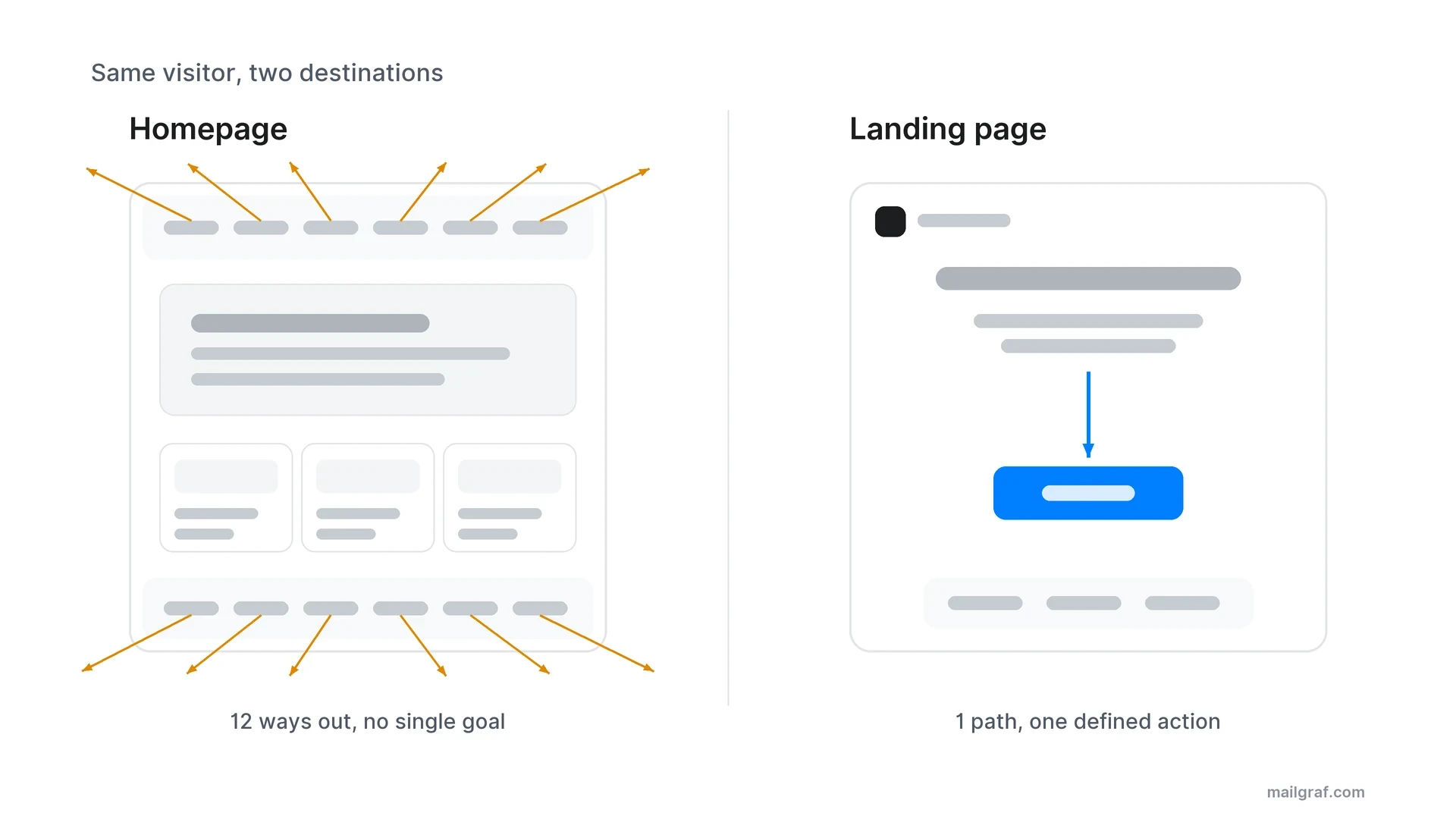
Every extra link on a page is a potential leak that pulls the visitor away from the goal. On a homepage those leaks are normal, because the aim is discovery. On a landing page every link steals a click from the conversion, which is why experienced marketers remove site navigation from these pages altogether.
Visitor intent differs as well. Someone on your homepage is curious about the brand in general. Someone on a landing page clicked a specific offer, so the interest is already declared. The page's job is to turn that interest into action before it cools.
The main types of landing page
There are two core types, and the choice depends on what you want from the visitor: information or a transaction.
Lead generation pages
These pages are built around a form. The visitor leaves contact details and receives something of value in return: an ebook, a webinar seat, a discount code, a free audit or a newsletter subscription. Every submission adds a permission-based contact to your email list.
The stripped-down, single-screen version that asks only for an email address is called a squeeze page. B2B companies and high-ticket sellers favour lead generation pages because their sales cycles are long and trust has to be built before money changes hands.
Click-through pages
Here a single button replaces the form. It takes the visitor to a checkout, a signup screen or an app store. E-commerce campaign pages, software trial pages and product launches are the typical examples.
The decision rule is simple: if the visitor is not ready to buy, use a form and continue the relationship over email; if they are close to buying, remove the friction and send them straight through with a button.
Four scenarios where landing pages earn their keep
The concept clicks into place when you see it inside real campaigns.
An e-commerce brand running a seasonal push. An Instagram ad announces the new collection. The page shows one product range and offers a first-order discount code in exchange for an email address. With no menu in sight, the visitor either takes the code or leaves. The captured email then powers every future campaign.
A software company collecting trial signups. Someone searches for the product category and clicks an ad. The page has one button: start the trial. A pricing summary, customer logos and a short objection-handling block support the button without upstaging it. This is the textbook click-through page.
A service business filling a webinar. A consultancy runs an industry webinar. The page states the date, the speaker and the three things attendees will learn; the form asks only for a name and an email. When the webinar ends, the firm holds a list of people whose interest in the topic is proven.
A creator growing a newsletter. A single-screen squeeze page: a headline, a one-line promise and an email field. "One marketing insight every Tuesday, read in five minutes" is the entire page. No archive links, no social icons.
Notice what the four have in common: each page carries one promise from one campaign, and each feeds its signups into a next step, either an email relationship or a sale.
Seven elements of a landing page that converts
High-performing pages do not come from templates. They come from getting the same seven elements right.
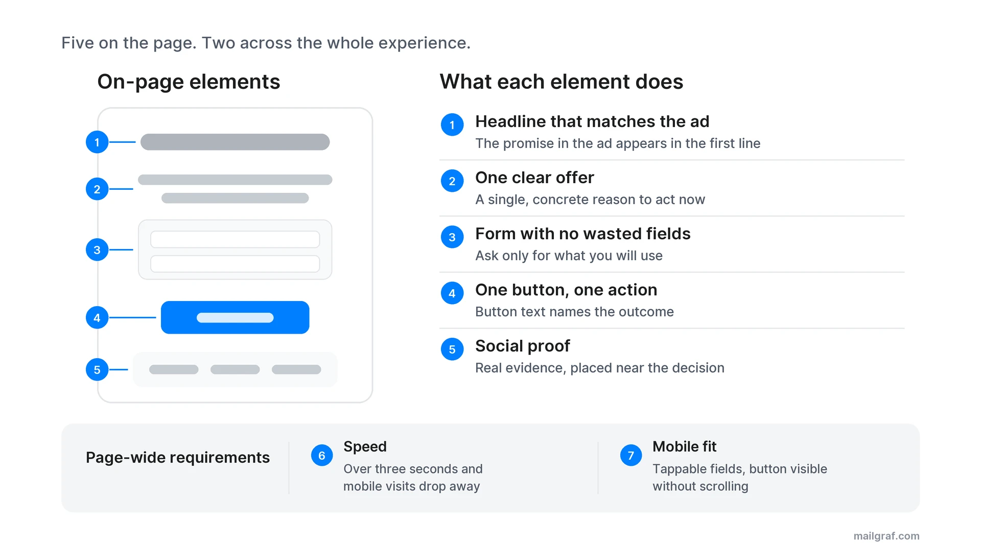
1. A headline that matches the ad. If someone clicks an ad that says "20% off" and lands on a page titled "Welcome to our brand", trust breaks instantly. The alignment between ad copy and page headline is called message match, and it is the first condition of conversion.
2. One clear offer. The page answers a single question: why should the visitor act now? The answer must be concrete. "Quality service" is not an offer; "hands-on setup help with your first campaign" is.
3. A form with no wasted fields. Every extra field lowers completion. Ask only for what you will actually use. A newsletter signup needs an email address; a quote request can justify a name and company.
4. One button with a specific action. The CTA (call to action, the button that carries the conversion) should appear once and say what happens next. "Download the ebook" or "Start the free trial" beats "Submit" because it shows the outcome before the click.
5. Social proof. Customer quotes, user counts or recognisable logos answer the "can I trust this?" question on your behalf. The proof must be real; an invented number backfires quickly.
6. Speed. Google's mobile research found that more than half of mobile visits are abandoned when a page takes over three seconds to load (Google, 2017). Heavy images and surplus scripts can end the conversion before the visitor even sees the offer.
7. Mobile fit. A large share of paid traffic arrives on phones. Form fields must be comfortable to tap, the button must be visible without scrolling, and the text must stay readable on a small screen.
The list is ordered by priority. If the headline and the offer are wrong, a perfect form and a fast page will not save you; fix the first two before touching anything cosmetic.
How to create a landing page in five steps
The order matters, because the most common mistake is starting with design before the goal is defined.
1. Define the goal and the single action
When the page has done its job, what has the visitor done? Write it in one sentence: "They registered for the webinar." If you wrote two goals, you need two pages.
2. Sharpen the offer
The exchange must feel fair: what the visitor gives (an email address, time, money) against what they get. An ebook for an email address is balanced; the same ebook for a phone number and a company registration number is not.
3. Build the page
There are two ways to build without writing code: a standalone landing page builder, or the tools inside the marketing platform you already use. The second option wins on data integrity. In MailGraf, landing pages, pop-ups and shareable signup forms live inside the email platform, so every signup lands directly in your list and can trigger an automation flow. There is no separate tool, no extra subscription and no data syncing to maintain. You can see the full toolkit on the features page.
4. Publish and connect the traffic
Whichever channel sends the traffic, align its message with the page. The promise in the ad creative, the promise in the headline and the text on the button should tell one story.
5. Measure and test one variable at a time
Launch is the start of the work, not the end. Test the headline, the button copy or the form length by changing one variable per test. Change two things at once and you will never know which one moved the number.
Where does landing page traffic come from?
A landing page does not find visitors on its own; it works as the destination of a campaign. Four sources dominate.
Paid search brings the highest-intent traffic, because the person is already looking for the topic. Paid social reaches people who are not searching yet but match the interest profile. Organic search takes time but produces lasting traffic with no cost per click. Even QR codes on printed material can point to a landing page; the channel changes, the destination does not.
The fourth source is often the most efficient one: your email list. There are around 4.6 billion email users worldwide (Statista, 2025), and reaching the people on your list costs nothing per click. Every button in your campaigns can target a landing page; our email marketing strategy guide shows how the pieces fit together.
Tag your campaign links from day one. If you cannot separate the traffic arriving from an ad and from a newsletter, none of the numbers in the next section will help you make a channel decision.
After the form: the landing page and email loop
Almost every guide on this topic ends at the form submission. The real value starts there. A landing page is not a one-off conversion tool; it is the intake channel of your email marketing.
A newsletter signup form makes the promise at the point of signup; building the mailing list carries that source and permission into later emails.
The loop works like this. The page captures a permission-based signup. To make that permission solid, use double opt-in: the person confirms the subscription by clicking a link sent to their inbox. The confirmed contact joins your list with consent you can stand behind.
The moment the contact lands in the list, automation takes over. The new subscriber enters a welcome email series automatically: they meet the brand, build trust and get guided to a first meaningful step. A landing page signup is a classic automation trigger, and if you know which page the contact came from, the messaging can match it. The ebook downloader gets educational content; the discount hunter gets the campaign.
Then the loop feeds itself. Every campaign you send contains buttons that point to new landing pages, and those pages produce new signups and new sales. When the ad budget stops, the ad traffic stops with it. The list stays yours.
How to measure landing page success
Chasing a single number is misleading. Four metrics need to be read together.
| Metric | What it tells you | What it points to |
|---|---|---|
| Conversion rate | Share of visitors completing the action | Overall page health |
| Bounce rate | Visitors leaving without any action | High means broken message match |
| Form abandonment | Visitors starting but not finishing the form | Form too long or trust too thin |
| Source breakdown | What each campaign delivers | Where the budget should go |
There is no universal pass mark for conversion rate; it depends on the industry, the traffic and the offer. According to figures compiled by Mailchimp, 2 to 5 percent is considered average and the best pages exceed 10 percent. Your own past performance is a more useful baseline than any industry average.
When the rate is low, check things in order: message match first, then the offer, then form length, and only at the end cosmetic details like colours and imagery. Most teams run this sequence backwards and spend weeks debating button colours.
Five common landing page mistakes
The same mistakes repeat so often that avoiding them is worth more than hours of design debate.
Leaving the navigation on the page. Pages derived from site templates usually keep the header menu and footer links. Each one is an exit door. Start from a blank page, not from the site template.
Squeezing two offers onto one page. A page that wants the visitor to start a trial and register for a webinar will get neither. Two offers mean two intents, and two intents need two pages.
Showing an empty thank-you screen. "Your submission has been received" leaves your warmest visitor standing in a void. The thank-you page is the place for a second micro-conversion: offer the webinar to the ebook downloader, show the setup guide to the trial starter. Almost no guide covers this step, yet it is the cheapest win in the funnel.
Piling all traffic onto one page. Sending visitors from different ad groups, carrying different promises, to the same generic page breaks message match from the start. The page-per-campaign principle exists precisely for this.
Building the page once and forgetting it. Offers age, prices change, ad copy gets rewritten. As the page stays frozen, the gap between ad and page widens and conversion quietly erodes. Review every live page alongside its active campaigns.
Does it make sense to build landing pages with AI?
AI tools genuinely speed up the mechanical part of page production. Headline variations, copy drafts and layout suggestions arrive in minutes, and search data shows interest in AI-built landing pages climbing steadily.
The limits matter just as much. AI cannot discover your offer for you, and it cannot maintain message match between your ad campaign and your page. Publish the generated copy unedited and you get a generic page that speaks in the same sentences as every other industry.
The practical division of labour: let AI produce the skeleton and the variations, then supply the offer, the proof and the brand voice yourself. Speed comes from the machine; persuasion still comes from you.
Frequently asked questions
What does "landing page" mean?
Literally, it is the page a visitor lands on after clicking a link. In marketing the term is narrower: a standalone page designed for one conversion goal, usually with no site navigation and a single call to action.
What is the purpose of a landing page?
To convert campaign traffic into a defined action: a signup, a lead, a registration or a sale. It exists to protect the visitor's focus, which is why everything unrelated to the goal is removed.
What is the difference between a landing page and a website?
A website is a set of interlinked pages serving many purposes at once. A landing page is a single page serving one purpose, and it often omits the site menu entirely. You can even run a landing page without having a website at all and point all your ads to it.
Can I have a landing page without a website?
Yes. Landing page tools publish pages on their own domains, so a standalone page can exist before any website does. This is common for short-term campaigns, event registrations and testing new product ideas.
How long should a landing page be?
Long enough to persuade, short enough not to distract. Low-risk offers such as a newsletter signup are settled in one screen. Expensive or complex offers need longer pages with proof, detail and answered objections.
Do I need a separate landing page for every campaign?
Ideally, yes. Each campaign carries a different promise, and message match only survives when the page is specific to it. Wiring several campaigns to one page blurs your measurement and drags the conversion rate down.
Originally published: Aug 5, 2026


Professional email marketing platform.
Don't miss out
Get the latest email marketing tips and exclusive updates.